Tag: Contrast
Escaping Through Sharpie

Introduction
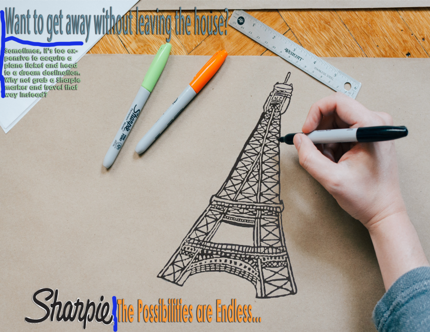
It’s great to get away from all the hustle and bustle of work and take time to relax. One means of relaxation is taking a trip to a dream destination. However, there are times when it’s impossible to get away, or there isn’t enough money to pay for a plane ticket. What should a person do in this situation? He could take a trip to a romantic destination by drawing and dreaming with a Sharpie marker. For my design class, I had to come up and craft my own creative ad advertising a common household product such as a permanent marker.
Minimum Requirements
One minimum requirement this project had was that at least two pictures had to be blended together. Written content such as body copy, a creative and original headline, and a call to action were essential. Another requirement was that the company logo of the featured product had to be incorporated into the design. The project also needed symbolic visual communication that was not actually literal.
Target Audience Analysis
The targeted audience for this ad was males and females in a current relationship. The design appeals to the audience because the drawing of the Eiffel Tower connects to them in their current status as couples. Also, the body copy suggests that the couples might be trying to be thrifty because there are some trips and outings romantic couples can do that may be expensive.
Design Analysis
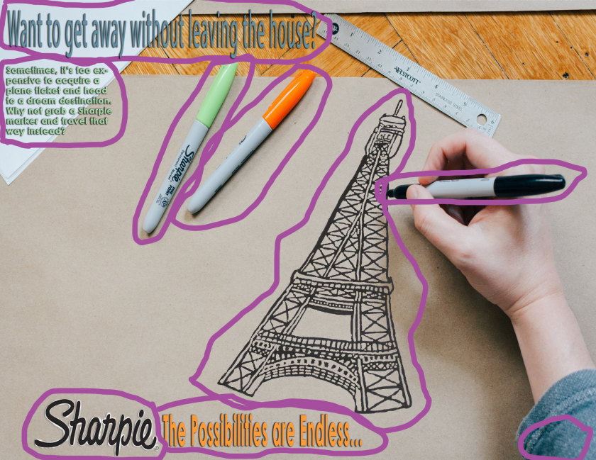
A contrast that is found in the ad is that the hand using the Sharpie is much larger than the Sharpie markers. Another contrast is that the Eiffel Tower drawing is larger than the hand.
One element of repetition I incorporated in my creative ad was using the drop shadow effect on my text so it could be seen by viewers and easy to read. Another example is that at least one Sharpie marker is present in the ad. The colors used for the text are found on the markers and the shirt sleeve.
An element of proximity is that the heading and the body copy are kept close together. This is also prevalent in where the logo and text on the bottom are next to each other.
I used the color orange for the text close to the Sharpie to bring a viewer’s attention to my message about the Sharpie permanent marker. I also incorporated light green and blue colors to show the coolness and calmness of the product and to have the text stand out from the background.
The typography used in the creative ad was Century Gothic and Myriad Pro, two Sans serif typeface. Century Gothic was used for the body copy and text next to the Sharpie logo. The Myriad Pro was incorporated into the creative ad’s heading.
For the body copy, Century Gothic was used at 11.24 point font in bold and the light green color. It was also present at 56.39 point font with the text by the logo because the words show no thick/thin transition strokes between the letters. When looking at the heading and text, one notices that the typeface used in the ad have no serifs present. Furthermore, because the letterforms have the same thickness, the two typefaces prove they don’t have stress.
One element that is incorporated through the typeface is size. While the ad’s body copy is small and visible to the audience to read, the heading and call to action is larger to allow the viewer’s attention to be directed to what the ad is featuring and convince him to purchase the product.
Conclusion
Sometimes taking a break from everyday life doesn’t require spending plenty of money on a plane ticket. It can be cheap. Instead of waiting in line for a bus, plane, or another mode of transportation, one can go on a romantic getaway by drawing out a dream destination through the use of a permanent marker. There always is enough time and budget to vacation through escaping with Sharpie.
Photograph Attributions
This photo was found on Unsplash. The photographer is Kelly Sikkema, a UX designer from Boston. In her opinion, design is not about making something snazzy but to find the right solution.
https://unsplash.com/photos/cXkrqY2wFyc
https://kelsikkema.myportfolio.com/about-me
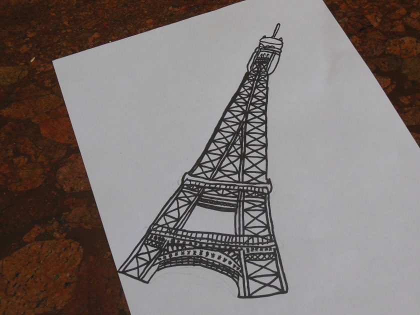
This is a picture of a drawing I made of the Eiffel Tower. I created it by drawing on a blank piece of printer paper in pencil. To make sure I was sponsoring the product I used for my ad, I outlined in a Sharpie.
Picturing Ocean Animals for Small Children
Introduction
The ocean is a marvelous place that is full of mystery and wonder. Creatures, big and small, inhabit these waters. One might decide to learn more about them. However, bringing interest to little children about animals that spend time in the ocean can be a challenge because they have a hard time picturing what they look like. For another project in my design class, I chose to create six icons of animals that can be found in the ocean.

Minimum Requirements
Aside from the icons being crafted in Illustrator, one minimum requirement that was noted for the icon set project was that no text, gradients, drop shadows, pixels, or raster effects were in the icon itself. Also, the icons had to range between 4 and 6 and were original, not created by someone else or being just a symbol. Additionally, each icon has to be able to communicate a single message, and all the icons in the set had to be consistently designed.
Target Audience Analysis
I intended my icons to be geared towards younger children. One example of this is how I designed the eyes of the sea creatures to be fun. Also, the cool colors of green and blue suggest that the animals are easy to look at and might be amazing to see in real life.


Design Analysis
Contrast can be found in the sea creatures themselves. Although the penguin, polar bear, and sea lion are animals that can be found in the ocean, they do spend part of their lives on land. Also, while all the creatures are mammals, the penguin is a bird while the sea turtle is a reptile.
Repetition in the sea creature icons can be seen in their eyes. Composed of one black circle and one white circle and grouped together, the single eye captures the attention of a younger child. Also, all the animals are surrounded by a blue circle to indicate that they can be located in the ocean.
Colors used in these icons consisted of blue and green, cool colors to represent the ocean. Although orange, a bright color, was included in the penguin icon, it was primarily used to identify where its beak and feet are. Pink was included for the dolphin’s body to depict the dolphin as being a creature that likes to have fun. Brown, black, and white were used in the polar bear, sea lion, and sea turtle icons to make them feel more real and natural to a child.


Conclusion
What we discover living in the ocean makes us aware of the mysteries that it contains. By sharing this with small children, parents and other adults make it possible for them to imagine a world outside their homes that is full of amazing subjects only found in nature. Sometimes, reading a story to a child about nature isn’t enough. Other times, it requires using simple icons to help someone with picturing ocean creatures for small children.
Bringing the Desert to Life


Introduction
When it comes to illustrating the desert landscape, troubles can arise. Some might describe it as a land mass primarily known for having plenty of exposure to sunlight. Others could say the desert is a place where water is scarce except for a chance of rain, leading to the plants residing there to adapt to life in the desert. The desert could also be defined as a location with dangerous creatures like rattlesnakes. So, for a magazine spread design project in my communications class, I chose to incorporate the majestic desert landscape. Through the use of photographs, an intended audience, color, typography, and the design principles of contrast, repetition, alignment, and proximity, I created my magazine spread shown above with my illustrations of the desert.
Magazine Spread Minimum Requirements Overview
For this Design assignment, the knowledgeable instructor set minimum requirements that had to be included for the magazine spread. Aside from the facts that the project had to include 3 pages, a 600+ article from LDS.org or BYUIScroll.org, and had to have been made in InDesign, other requirements were that the spread had to have at least two relevant photos taken by the student earlier in the semester, one image or shape word wrap, more than two columns in the layout, contrasting typography, consistent heading and body copy, and have the article broken up with three or more headings/subheadings.
Targeted Audience Analysis
When I started on this project, I had planned on my target audience being people who really wanted to understand the Holy Ghost better. However, as I worked on my magazine spread, I realized that I wanted the design on my magazine spread to be read by youth and adults, who should always know that the Holy Ghost is there for them as a constant companion. One way I had this design appeal to my target audience was to create my own shape of a nebulous spirit using the pen tool to represent the Holy Ghost. I also had my color scheme be bright colors to attract the viewers’ attention. In addition, I had my theme feature the desert as a reference to Elder Stevensen’s Holy Ghost experience from his childhood with the rattlesnake.
Design Analysis
I chose to use the desert landscape for my design because of an idea I had from studying my article. Since one of my favorite General Conference stories was Elder Gary E. Stevensen’s tale about an experience he had about the Holy Ghost, that gave me the idea of using the desert for my design. At first, I tried recreating the rock with the rattlesnake perched on it, but then decided to go beyond the rattlesnake by using bright colors and other elements of the desert to bring forth my interpretation of the desert.


Contrast is prevalent through the magazine spread. One example is found in the typeface. While the text itself is bold and maroon, the heading/subheading are white and italicized. Another contrast is located on the title page where the article’s title has shadows in its lettering while the author’s information doesn’t. An additional contrast can be found in the photos. The picture of the rattlesnake features a reptile while the red-tailed hawk image displays an animal that flies.

Repetition is commonly used through the magazine spread. All the pictures used are images of subjects found in the desert like rattlesnakes, cactus, and the sun. Also, the colors of red and maroon are repeated to identify what are headings or text.


Alignment does play a role in the magazine spread. The article’s name and author’s information is aligned with each other to let a reader be introduced to the article. All the text in the article is aligned to the left to make it clear that it is all part of the article.

Proximity is also noted in the magazine spread’s design. The headings/subheadings are kept close together to help a person identify which topic they are addressing. Also, the images that are text wrapped are kept in close to proximity to show their interactions within the text.
Typography used for the magazine spread were Elephant, a Slab serif typeface, and Century Gothic, a Sans serif typeface. For the text, Century Gothic was used at 10 point font in bold and the colors yellow and maroon. It was also included in the author’s information at 48 point font because the words show no thick/thin transition strokes between the letters. Another way of categorizing Century Gothic as Sans serif is that no serifs are found anywhere. Furthermore, because the letterforms have the same thickness, Century Gothic proves that, as a Sans serif typeface, it doesn’t have stress.
For the heading/subheading and the article’s title, Elephant was used with 60 point font for the title in red while the heading/subheadings were also the same color but were had 16 point font and italicized. The hyperlink for the article was placed in 26 point font in black. One indicator that Elephant is a Slab serif typeface is that the serifs found on the lowercase letter are not only horizontal but have thick slabs. Vertical stress can be located on the letterforms too. Also, the Elephant type can be further proven to be a Slab serif typeface because it has very little or no thick/thin contrast in the strokes.
One element that is incorporated through the typeface is size. While the article’s information and text is small and still visible to the audience to read, the headings/subheadings and title are larger to allow a person to recognize what the article’s main subject is and the topics that provide reasons to answer the question “What Does the Holy Ghost do for You?” The spread does also show to have the element of weight. With the different strokes used, the Sans serif typeface and Slab serif typeface not only show professionalism but also importance. Structure within the magazine spread further displays evidence that though the typefaces are different, they are compatible when used together. Additionally, the element of direction is also present. By having the typeface in a horizontal and vertical positions in the columns, the spread allows the article’s text and info to being easily read and accessed. The final element shared in the image is color. With the yellow and maroon colors, the words in Sans serif appear more professional and command a reader to pay attention. On the other hand, the words in Slab serif and what it is displaying direct a reader to seeking for more information about the Holy Ghost.
Most of the colors used for the spread were warm colors like orange and red. Red was used to bring attention to the article’s title and separate the subheading/headings from the text. Orange was primarily used for the background. White, a neutral color, was incorporated into the last page in the spread as a background color as well as a heading color for the second page on the magazine spread. Maroon was used for the text as a means to draw a viewer’s attention to the article itself. The color yellow was primarily used in the text about the author’s information to identify whose words they are.
I chose pictures that had the desert element because that was one way I could illustrate my idea of the desert landscape aside from using warm colors like red, yellow, and orange. The reason why I included the rattlesnake and hawk photos was because they are some of the creatures that can be found in the desert. I also included the desert landscape and sunrise photos into my magazine spread since they not only can be discovered during a time of natural light but also showcase the wonder and color that can be only found in the desert.
In each of the photos seen below, at least one element of photography is used. Leading Lines are clearly visible in the sunrise picture to draw a viewer’s attention to the sun. Additionally, the photo also displays Depth by having the shadow contrast alongside the orange sunlit sky highlights. Leading Lines can be found in the rattlesnake’s curvy body, the hawk’s outspread wings, and the desert landscape. Furthermore, the Rule of Thirds is applied since the subject is focused on one of the unseen intersections to include balance and interest for the audience.


Conclusion
For a photographer, capturing a moment in the arid desert landscape take plenty of patience and effort. That can also apply to creating a magazine spread that showcases the beauty of the desert. In my magazine spread, I show another perspective of what amazing subjects can be encountered in the desert. The desert landscape is not only By incorporating the design principles along with the elements of color, photography, and typography, a person has the ability of visually bringing the desert to life.
Photograph Attribution

The photo I featured for the title page of my magazine spread is a photo I took two weeks ago in the desert mountain behind my neighborhood. I had to tweak it in Photoshop because the contrast between the highlight and shadow elements seemed unbalanced to me. To take this photo, I had to use the zoom function on my camera and take the picture at sunrise, which is one of the best times to get natural light for a photograph.

I found this rattlesnake picture online at tucson.com. The photographer who snapped this awesome pic is Xavier Gallegos. I incorporated this into my magazine spread by clipping the rattlesnake image through the pen tool on InDesign and pasting it into the pen outline I made. Another way I incorporated it into my project was to text wrap it to make it stand out when surrounded by text.

This picture of a magnificent red-tailed hawk is another photo I found online at BirdingPictures.com. The person who took the photo was Lauren Shaffer. Like the rattlesnake image, I clipped the photo using InDesign’s pen tool, pasted it into the outline I made, and text wrapped it.
http://www.birdingpictures.com/red-tailed-hawk/

This is a photo I took of the desert mountain behind my house. Like the sunrise picture, I had to take it at sunrise and zoom in using my camera. To insert into my spread, I had to crop and text wrap it along with off-setting it by 0.1875 in.
Building a Better World Through Reading

Introduction
The above image was found on the Fort McDowell Tribal Library page as an announcement made earlier this year for Maricopa County READS. Maricopa County READS is a well-renowned summer reading library program that the Maricopa County Library District provides to all libraries found in the Maricopa District of Arizona to encourage reading during the summer months and prevent students from learning loss between school years. Since the summer of 2013, Maricopa County now hosts all 62 libraries within it with more than 77,000 people of all ages participating annually in the summer reading challenge. Through this activity, Arizonians learn how to read for 20 minutes a day, create their own personal library, and discover more about the subjects they read through attending fun literacy events such as a writer’s conference to learn more about reading and other subjects that interest them.
http://www.ftmcdowelltriballibrary.org/summer-reading-2017/
https://maricopacountyreads.org/Info/about
Typeface #1

The first typeface found in this image is Sans Serif. It is easily identified in the picture because the words “Summer Reading Program” show no thick/thin transition strokes between the letters. Also, others indicators that prove the typeface is Sans Serif is that there are no serifs found anywhere. Furthermore, the Sans Serif typeface shows no stress due to the letterforms all sharing the same thickness.
Typeface #2

The second typeface that is identified in the photo is Descriptive. It is noticeable because it is very distinctive. While the other information in the picture is one particular color, the Descriptive typeface is multicolored, which sets it apart from the other words. Also, it is limited. Although the typeface is used to state the 2017 theme of Maricopa County READS, that is the only purpose it has. Though it is not repeated numerously through the picture, the Descriptive typeface clearly identifies what the main theme is for the yearly library program.
Contrast

Both the Sans Serif and Descriptive typefaces contrast well enough to deliver the message of the upcoming Maricopa County summer reading program. One element that is incorporated is size. While the summer activity information is small and still visible to the audience, the program’s theme is bigger to emphasize it as the primary focus. The image also includes the element of weight. With the different strokes used, the Sans Serif typeface suggests professionalism while the Descriptive typeface also includes the possibility of fun. Structure can also be seen in the ad because the typefaces are different and work well together. Another element that identifies the contrast between the two typefaces is form. The Descriptive typeface is all in uppercase letters to clarify what theme is being used for the annual summer reading library activity. On the other hand, the Sans Serif typeface mostly consists of lowercase letters to provide viewers with information about when it starts and how to access the program if anyone is interested. Additionally, the element of direction is also present. By having the typeface in a horizontal position, the image also provides a way for the information in it to be vertically. The final element shared in the image is color. With the orange color, the words in Sans Serif appear more professional and command a reader to pay attention to the image and what it is displaying. This is also indicated by the Descriptive typeface, which is in different colors to express the wonder and joy at what the audience might enjoy if they participate.
Conclusion
The principles of typeface and type contrast play a great contribution to Maricopa County READS 2017 Summer Reading Program. They are easy to recognize and can be understood by the audience. People who come across it are able to identify what the image sponsors and pay attention to the information it contains. Maricopa Country READS provides a lover of books or a budding reader in Arizona to be engaged in building a better world through reading.
OUR MISSION IS TO MAKE SURE MOMENTS LIKE THIS NEVER BECOME EXTINCT. COME BACK TO WILDLIFE. BY OUR MAN IN HAVANA FOR THE BRONX ZOO.
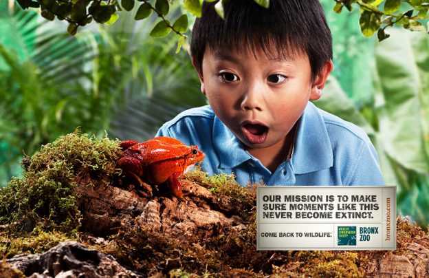
Intro
This ad was created by Our Man in Havana, a USA advertising company, for the Bronx Zoo, not to make people aware of the zoo, but to encourage native New Yorkers to revisit a place they went to as children. As a organization that is also part of the Wildlife Conservation Society, the Bronx Zoo invites people to explore the mysteries wildlife has to offer. Our Man used a compelling message to show the viewers what they lack: some wonder.
https://adsoftheworld.com/media/print/bronx_zoo_frog
http://omihnyc.com/candice-whitman

Contrast
In this ad, we can notice that one of the main contrasts is the boy and the tomato frog. Although both are present, the boy is big while the frog is small. An additional contrast is the expressions the subjects are both showing. When observing the amphibian, the boy’s eyes and mouth are wide open because they are astonished at what they see. On the other hand, the tomato frog is relaxing and not being concerned about the boy’s reaction. A third contrast featured in the ad is the text itself. Though the text is the same font, the size of the messages are opposite to make it clear that the ad is expressing wonder at an amazing place that is new yet familiar. Lastly, the fourth contrast is in the word “wildlife,” which is in the contrasting fonts of brown and yellow, to signify why it is important.

Repetition
In the ad, the advertising agency makes it clear that the ad is for the Bronx Zoo because its name is featured in the lower right corner of the ad alongside the symbol of the Wildlife Conservation Society. The name is also repeated in the website, making it known where one could go and find information about the place. Another repetitive element this ad features is wildlife, which is shown not only in words but in the background, which are full of foliage and items that can be only found in the wild, excluding the awestruck child.

Alignment
The information that connects the ad to the Bronx Zoo is featured as a united compilation on its right side. That directs the reader to notice and identify what Our Man in Havana is advertising about the zoo. This also gives the ad a more professional look and frees up blank space for the other elements of the ad to be displayed.

Proximity
The messages about the zoo are grouped together in close proximity. Along with the website, the symbol of the Wildlife Conservation Society identifies which zoo is being mentioned in the ad. The information isn’t scattered all over the place but concentrated in one area.

Color
Color is highly featured in this ad. With the cool colors of blue, green, and brown, the ad promotes colors that make it appear more natural and part of the background. However, the tomato frog is bright red, which makes an impact on the ad because the color is having others recognize why the Bronx Zoo is encouraging others to wonder what it has to offer and why one should try to visit the zoo more often.
Conclusion
In this ad created by Our Man in Havana for the Bronx Zoo, the design principles of contrast, repetition, alignment, proximity, and color can be identified. These principles allow the ad to be clear and easy to understand by the audience. Viewers are able to familiarize the ad’s theme and purpose. The Bronx Zoo provides a simple message that sometimes a person needs to get out of the city and come back to discover the joy and wonder wildlife gives.
